top of page

logo design
"We must iterate over and over, trusting that after setting the mind free, something organic and new will happen. Nothing is set or for sure going to happen.
That is the beauty of creativity"
- Christoph Niemann
LOGOS

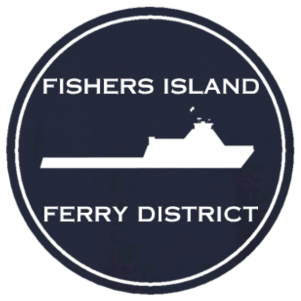
The Fishers Island Ferry District commissioned me to make their new logo. It was a long back and forth process with a ton of iterations. The owner was looking to incorporate the boat and the island into the logo. They decided to use two logos, using one for email signatures and other graphics.
ITERATIONS

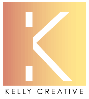
Kelly Creative Co. is a photography and graphic design shop that I created with my brother. The logo design started out basic and evolved to something that was more abstract and emotion evoking. Iterations were first abstracted from letters "KC", and turned into a logo that spoke more to who we were... dreamers and creators. It spoke to what we do as well. To move client's dreamy ideas forward to crisp finished products.

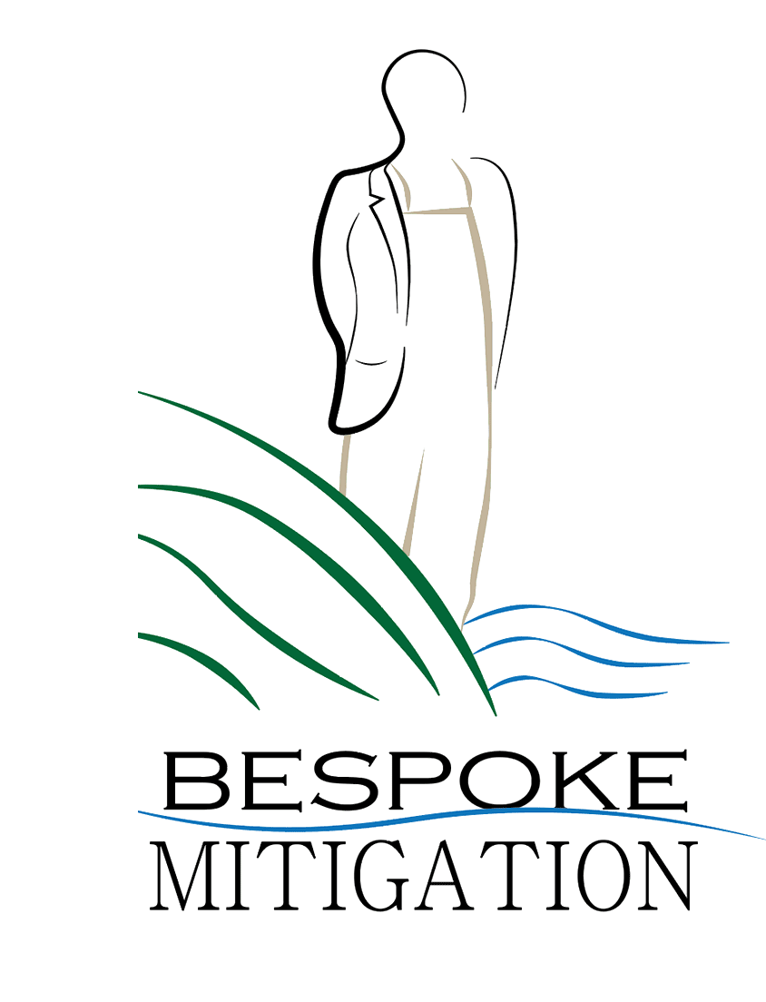
Bespoke Mitigation uses market based approaches to give ecosystem services monetary value. The client wanted the logo to speak to both the businessman and environmentalist. The logo uses a person in a suit and waders standing in a wetland to portray these associations.

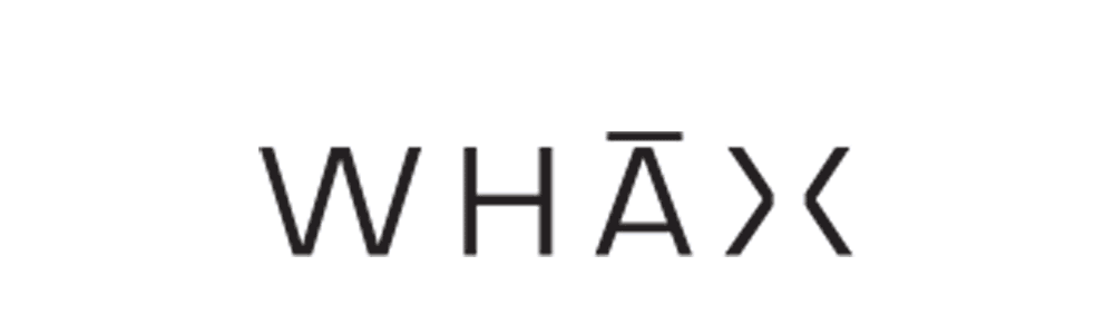
WHAX is an up and coming Musician. He has created a platform for more than just music. It is a space for learning and knowledge sharing among new musicians. It includes self-improvement blogs, interviews with with new musicians, and instructional videos on music making.

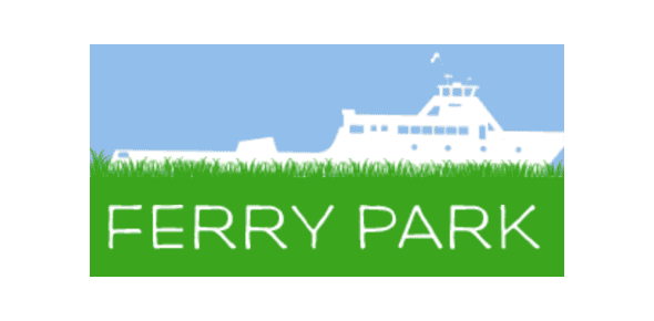
Ferry Park is a initiative for green space. The Fishers Island Ferry District referred me to a group changing a section of the parking lot to a park. They were looking to embody the park as a gateway in the logo, with some sentiment toward green space.

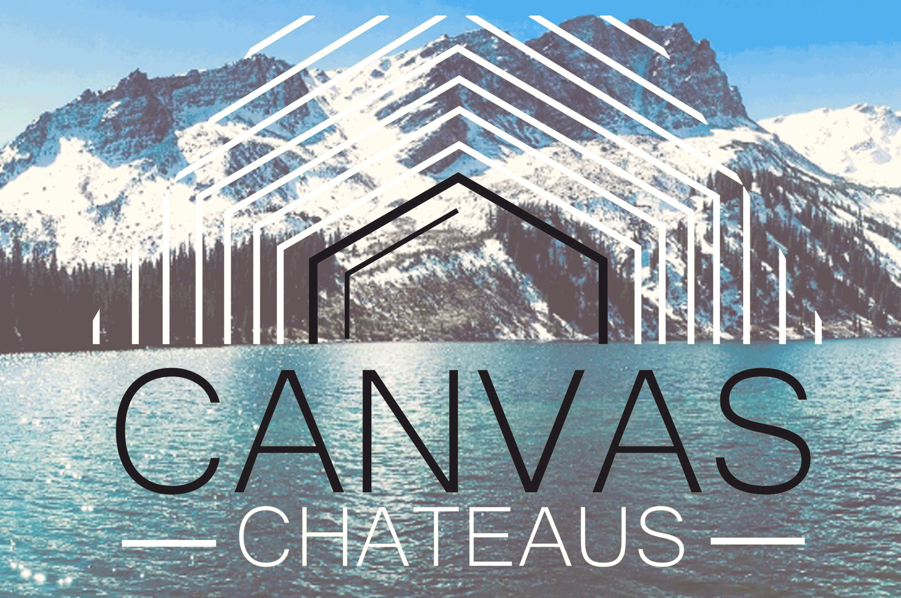
I did this logo for a company me and a friend of mine were trying to start. We were wanted to create a logo that both showed a tent and connection back to nature. The company was going to be a platform tent rental. Here the tent shape radiates into the sky creating the connective feeling we wanted between the tent and outdoors, but in a clean and simple look.
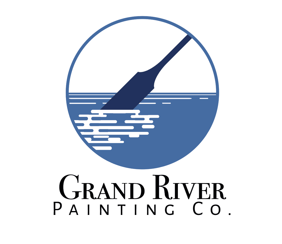
Grand River Painting Co. does interior and exterior pant jobs for residential and commercial in Colorado. The owner wanted a logo that spoke to the duel nature of the name. Iterations have played with the idea of the river paddle and the paint stoke as similar notions.
bottom of page